Use Heatmap
Have you ever wondered how users interact with your Power BI reports at the visual level? Where do they click? A heatmap gives you a visual story of user behavior, spotlighting what's working and what's not, so you can make data-driven improvements to your reports.
How the Heatmap Works
By default, BI Pixie tracks click events when users interact with visuals in your reports. However, to display these interactions as a heatmap, BI Pixie also needs to know the position and dimensions of each visual on every page.
When you enable the heatmap feature, BI Pixie collects the layout metadata (position and size) of all visuals in your tracked reports. This data is combined with the click events in BI Pixie Dashboard to render an interactive heatmap overlay on each report page.
Enable Heatmap
- In the BI Pixie Portal, navigate to Tracking Setup from the sidebar.
- In the left hierarchy panel, select Account Defaults, or select a specific workspace or report to enable heatmap at a more granular level.
- Find the Interaction Tracking section and make sure Track clicks at the visual level is enabled.
- Click Save settings and confirm the save dialog.
- Navigate to the Add Pixies page (accessible from links in the Overview checklist, Managed Reports, or the success message after saving settings) and update the Pixies on your reports to apply the changes.
After updating the Pixies, BI Pixie will collect the visual layout data from your reports. The heatmap will be available in the Heatmap page of BI Pixie Dashboard.
Note: Enabling visual-level click tracking significantly increases data volume. Each page view generates additional rows per visual, and each visual interaction adds more. For reports with high usage, this may slow down the refresh time of your BI Pixie Dashboard. Consider whether you need visual-level detail or if page-level tracking is sufficient for your needs.
Viewing the Heatmap
In BI Pixie Dashboard (Power BI app):
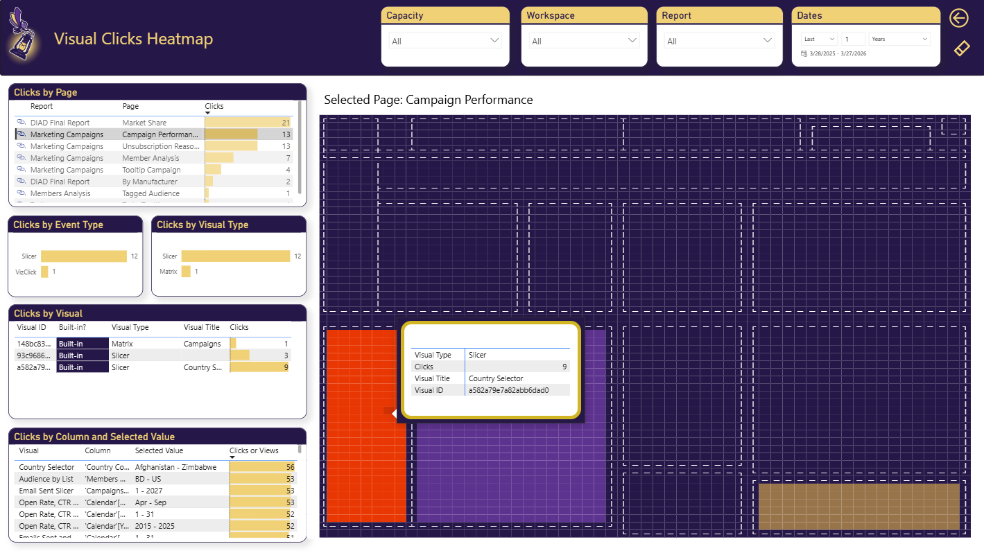
- Navigate to the Heatmap page.
- Select a report and page from the filters.
- The heatmap overlay shows which visuals received the most clicks, with warmer colors indicating higher engagement.
Related Resources
- Tracking Setup — Review all available tracking settings.
- Set up Dashboard — Install the Power BI app to view engagement analytics.
What's Next
- BI Pixie Dashboard — Explore all dashboard pages and heatmap visualizations.
- Collect User Feedback — Add feedback controls to your reports.
- Embed User Surveys — Add NPS and business value surveys to your reports.